Learn About The Official Uniform of the Winona Wave Riders©
Click an Item to Learn More About It!
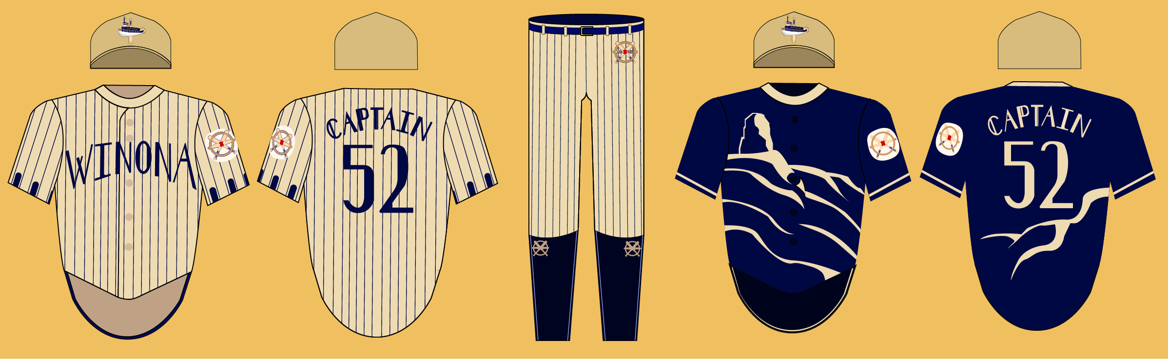
The Home Jersey
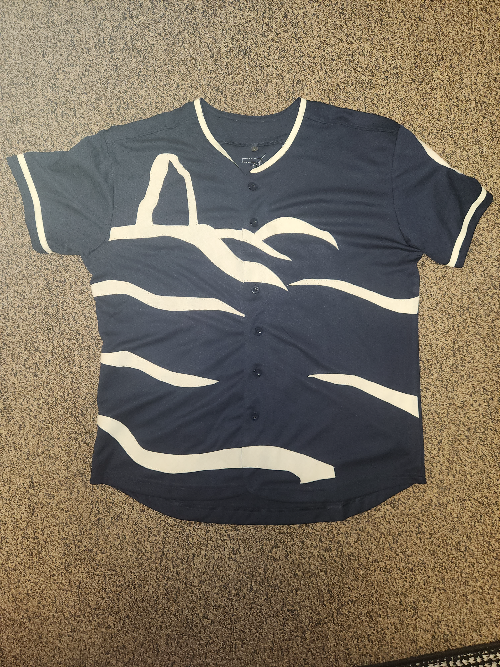
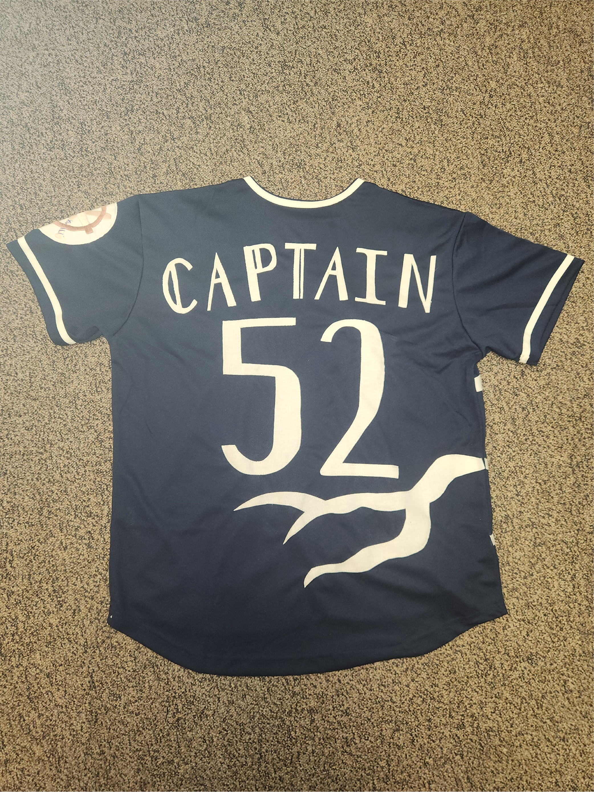
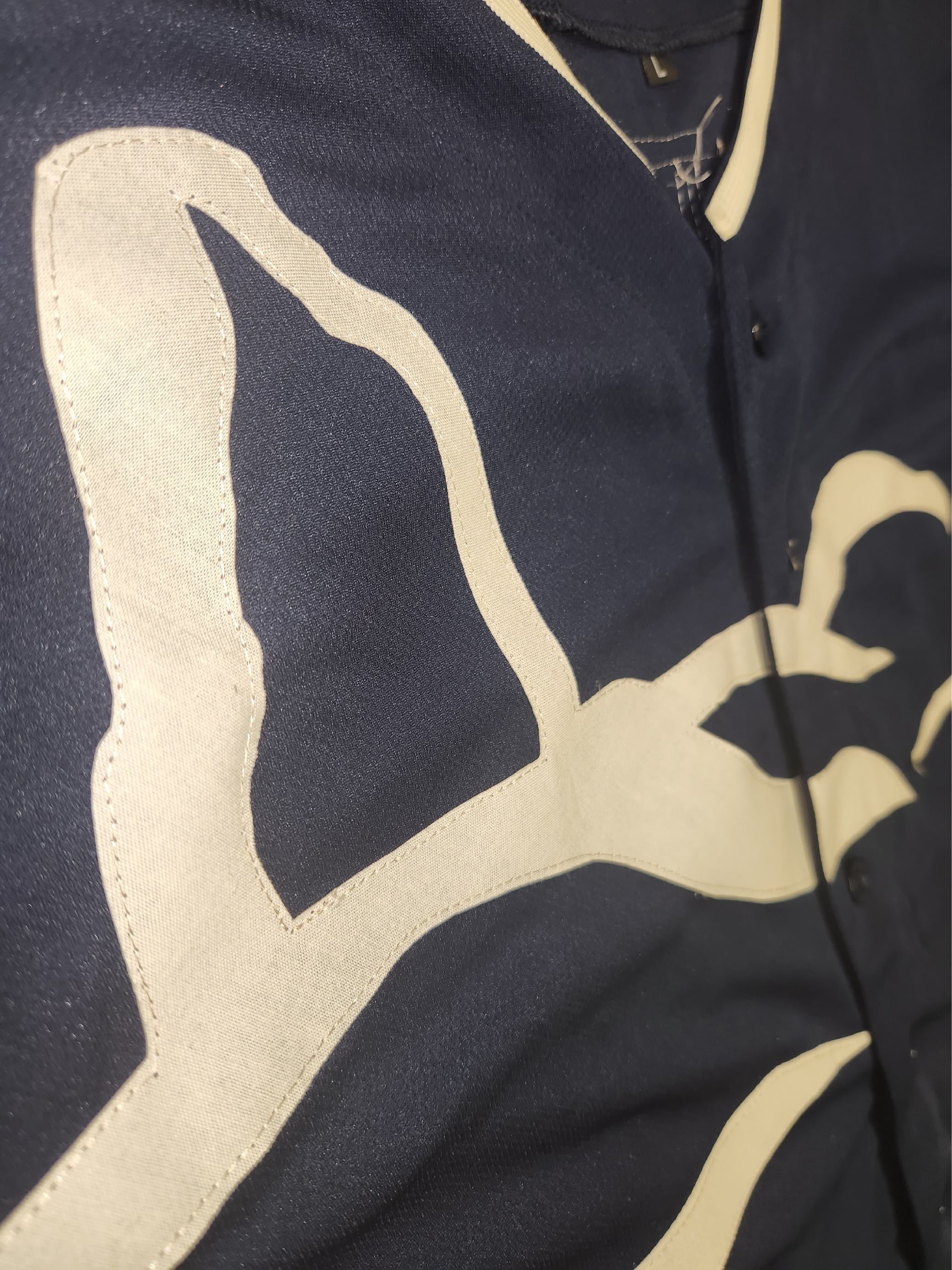
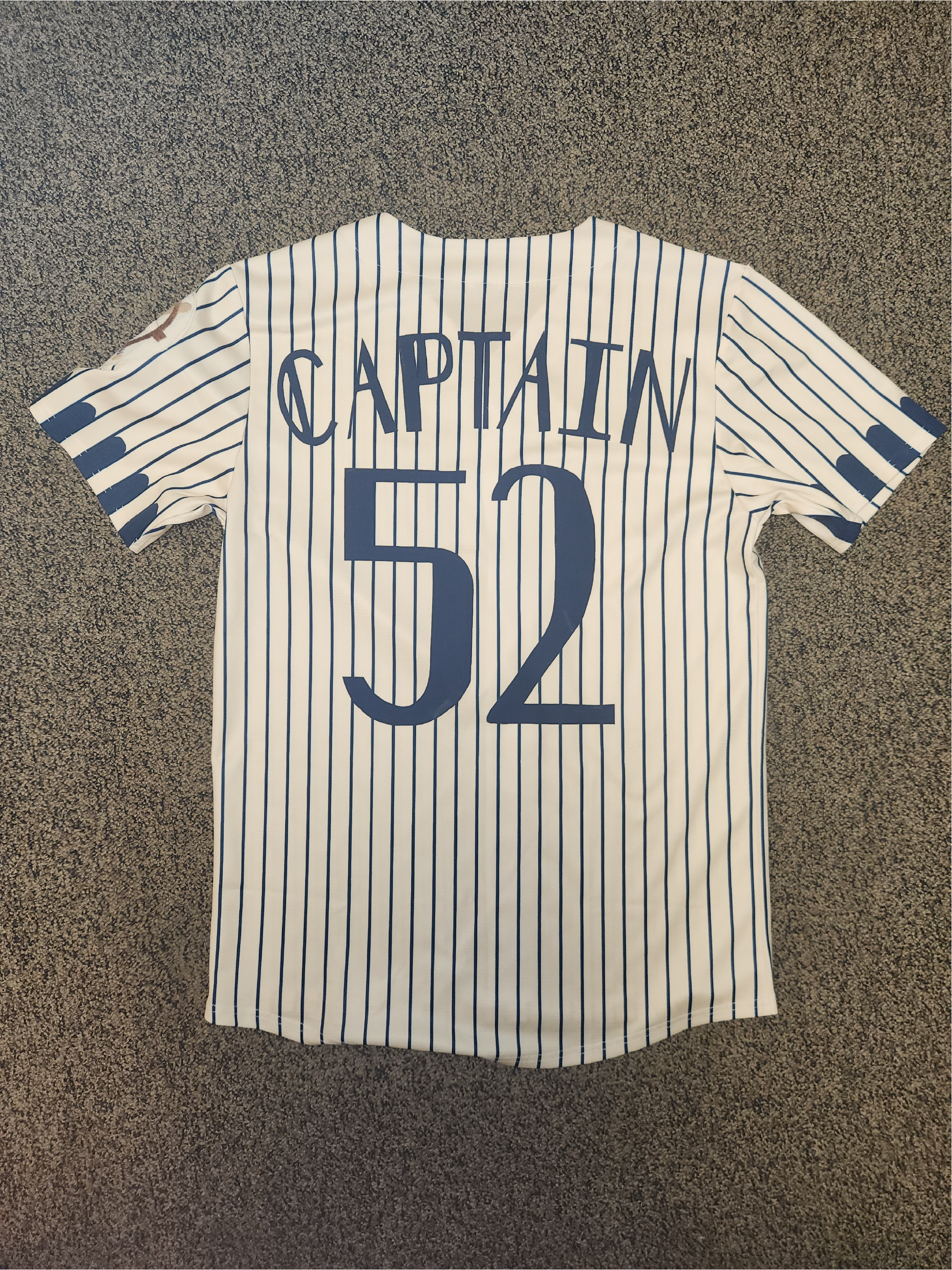
One of the most important pieces of a team and their brand recognition is their jersey designs. Our designs attempt to capture the charm of Winona as well as reference and pay homage to the source material, that being the sailors and legacy of Winona as we know it today! On the front of the jersey (pictured left) we attempted to capture the landscape of the bluffs in our design. We also included the Sugar Loaf rock formation that famously overlooks the city of Winona. In the way that Sugar Loaf is a symbol of Winona, we want this jersey to be a symbol of its wonderful community. On the back of the jersey (pictured middle) there is the typical baseball jersey layout with the name and number. In addition to that, there is a shape resembling a tree root below all of that. This root is representational of many things about Winona, but it resembles the resiliency of the community above all. Similar to how tree roots can carve through cliff sides and rock (like you see on the bluffs of Winona), the community puts their "roots" down and fights on. We use this mentality with our team and it starts with our home jerseys!
The Away Jersey
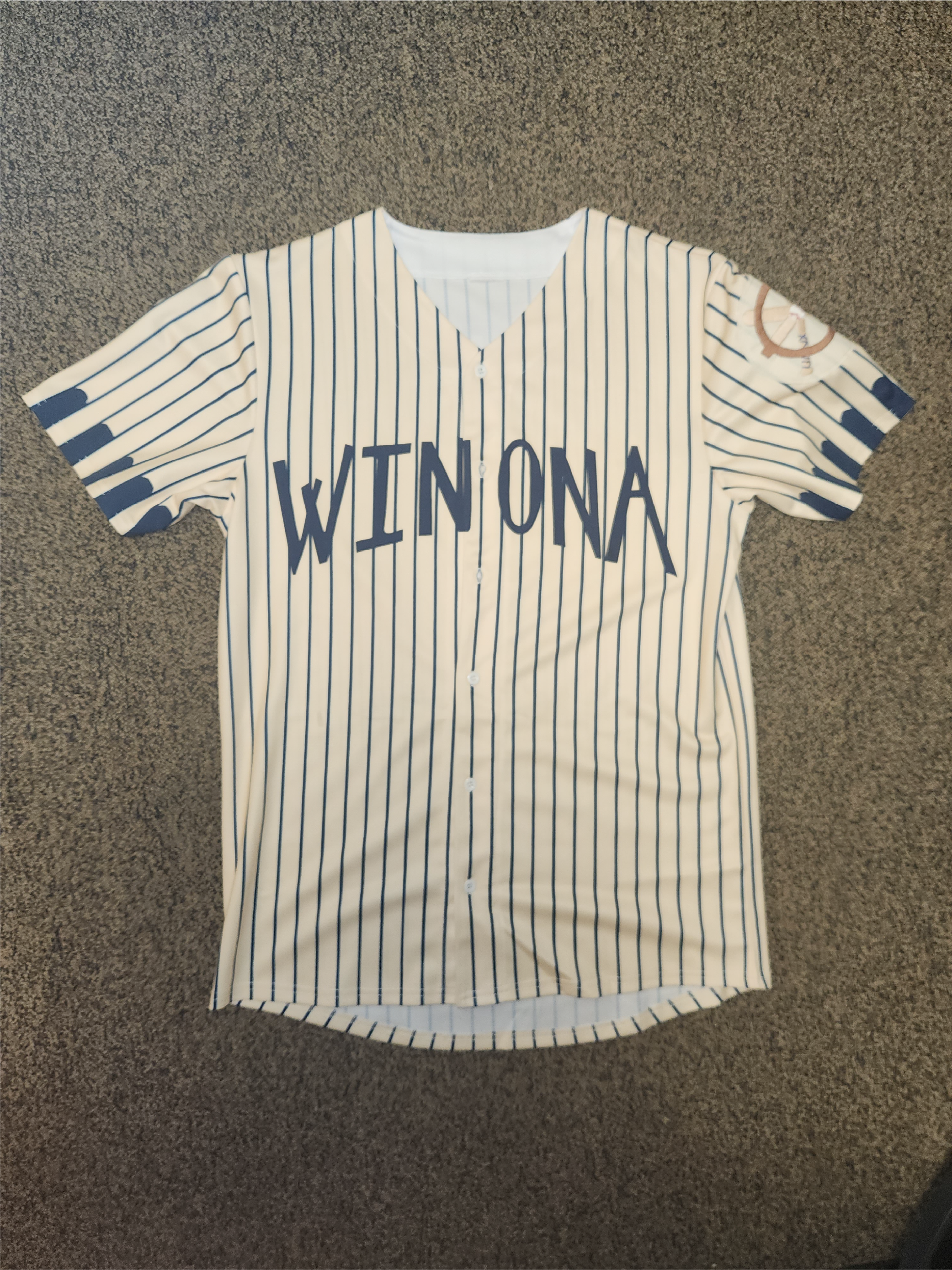
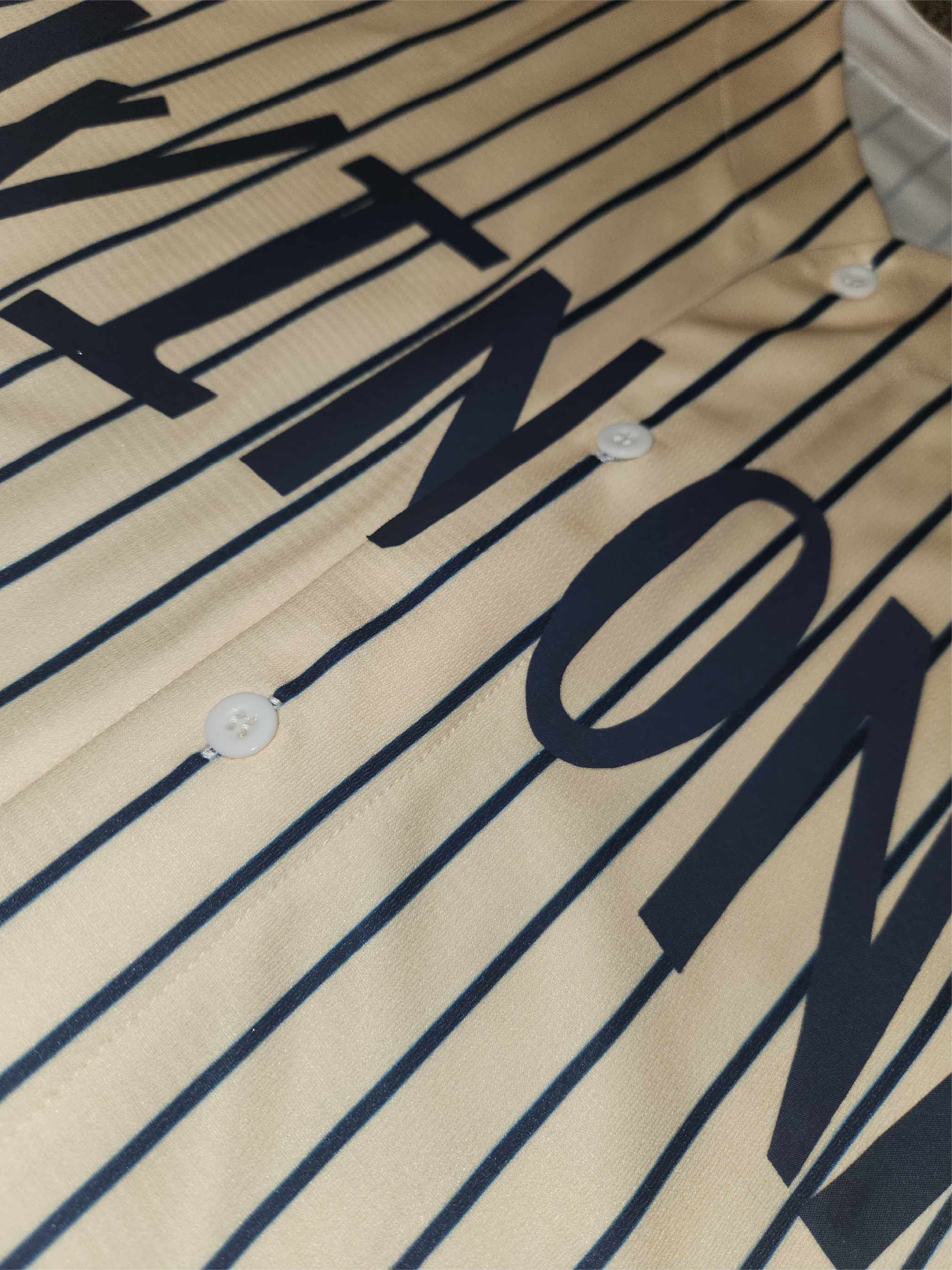
If brand recognition is important for a team, then it should be consistent throughout every material. When we play away games, we want everyone to recognize not only who we are, but where we are from and what we stand for. We do this through design details on the away jersey. First off, this jersey displays the iconic cream color that is so synonymous with that classic look we are trying to go for. In addition to that, it features a unique font for the "Winona" on the front of the jersey (pictured left). The sleeves feature a "window" shape that references the windows commonly seen on a ship as well as the historic windows seen in the refurbished architecture of downtown Winona. If the home jersey pays homage to the landscape, then the away jersey pays homage to the man-made structures and how they shaped how we see the city.
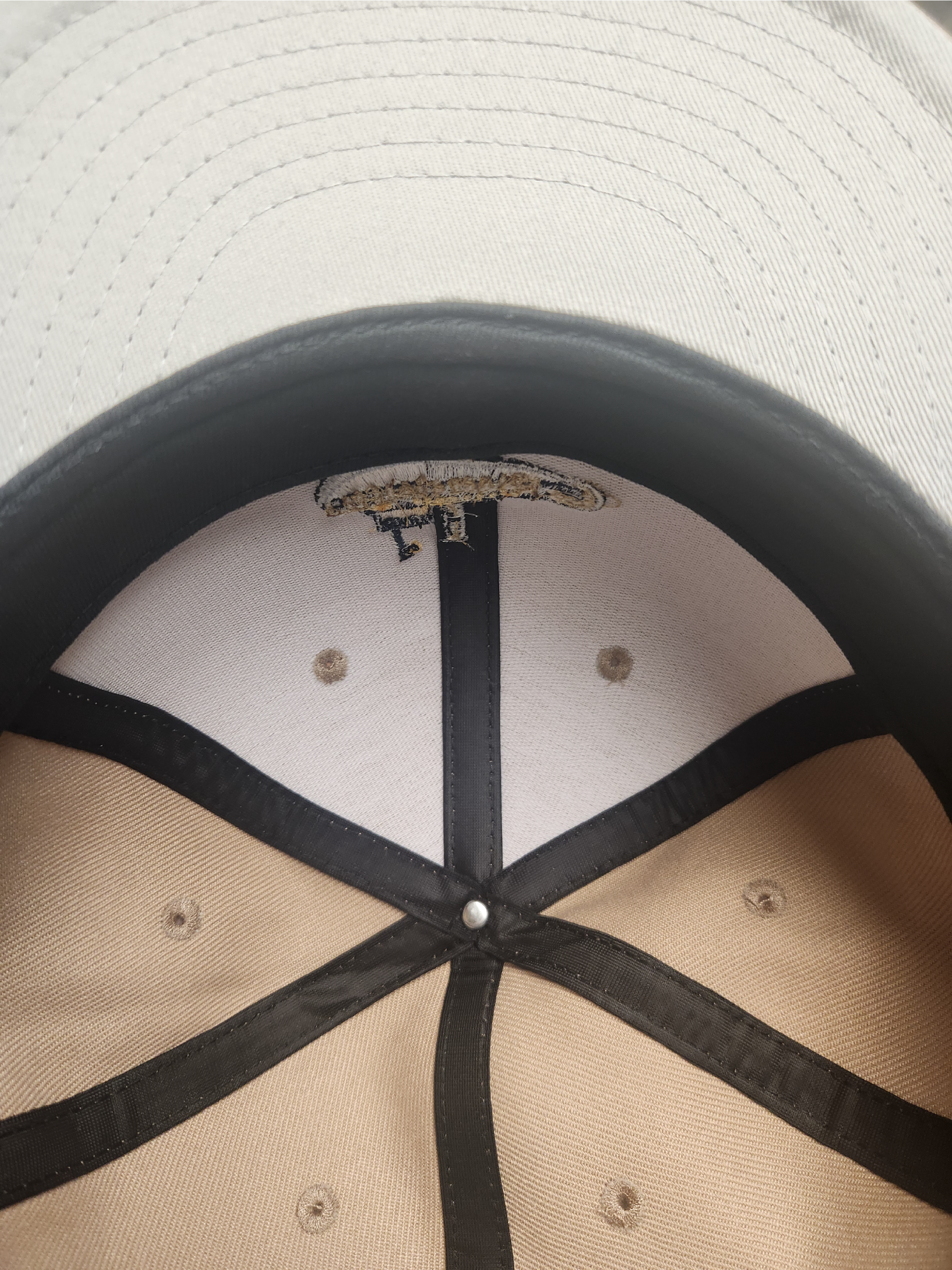
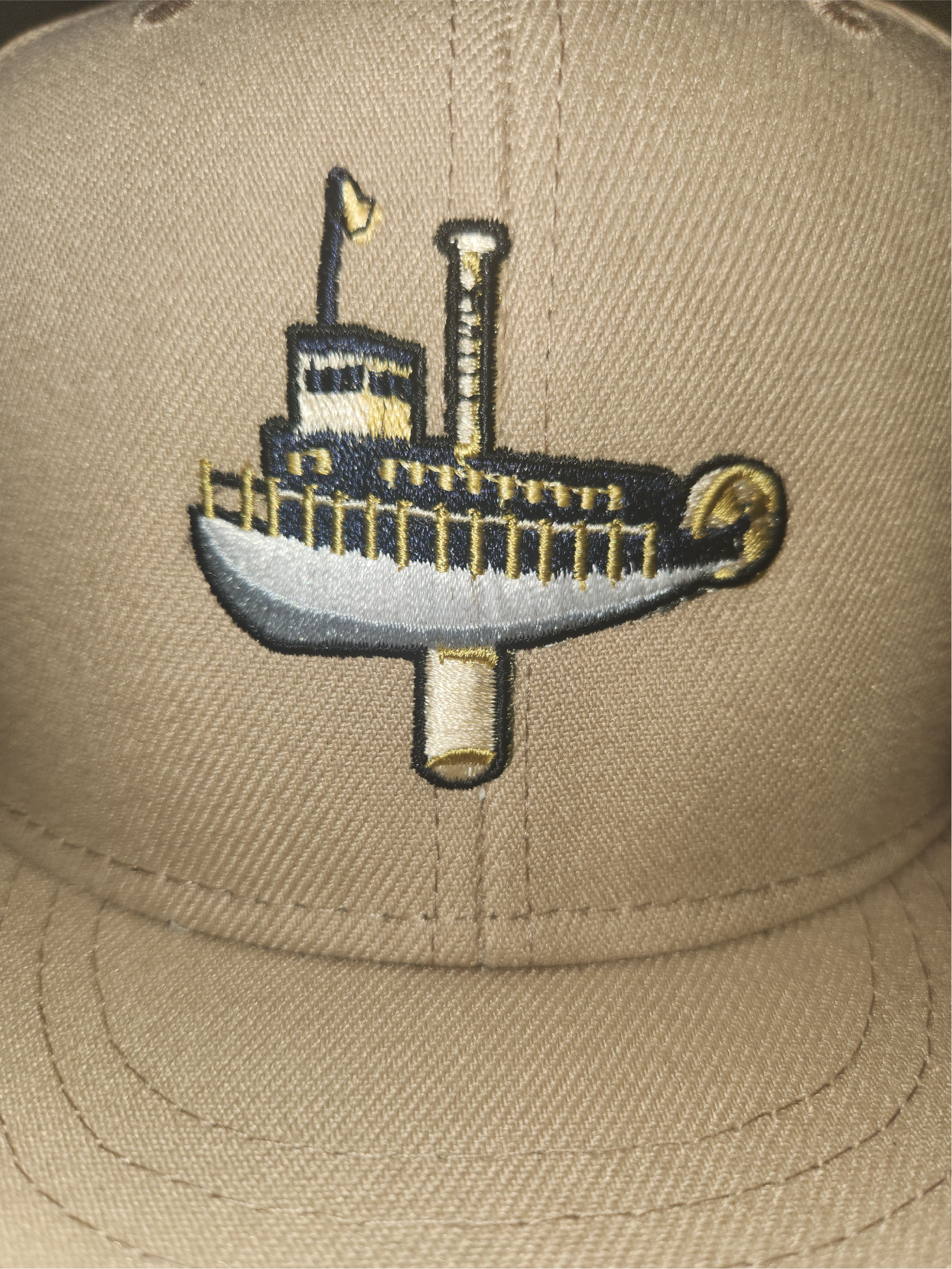
The Hat
Why simplistic in nature, the hat is the crown of the champion. Our hat features our iconic primary logo (pictured middle). While the color of the hat was contested for a majority of development (specifically between gold, navy, and cream-beige color), we decided to use a dark beige-cream look. It effectively displays the logo without becoming too connected to the rest of the player uniform. In other words, the hat is its own piece and can be separated from the jersey and still look good.
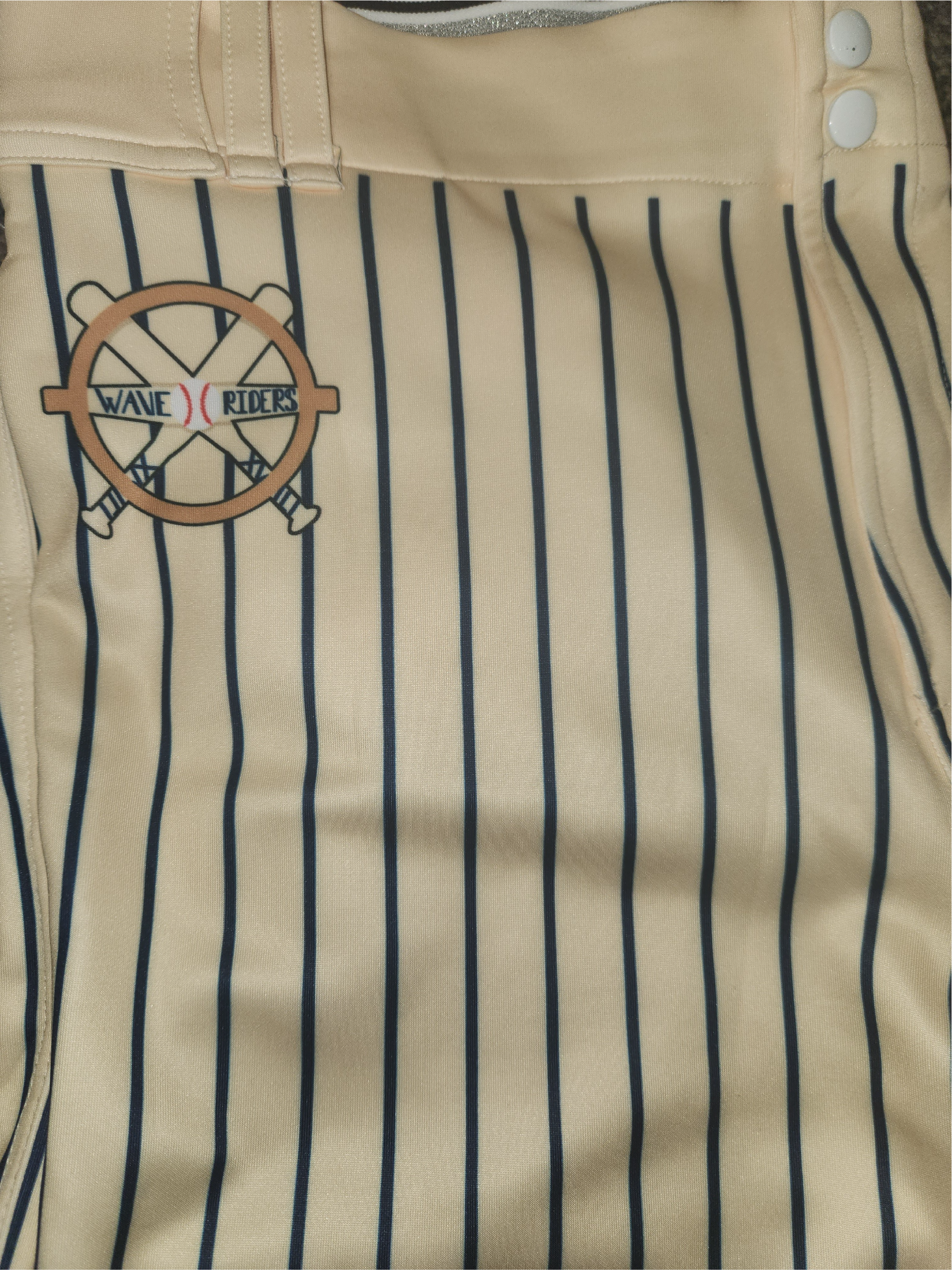
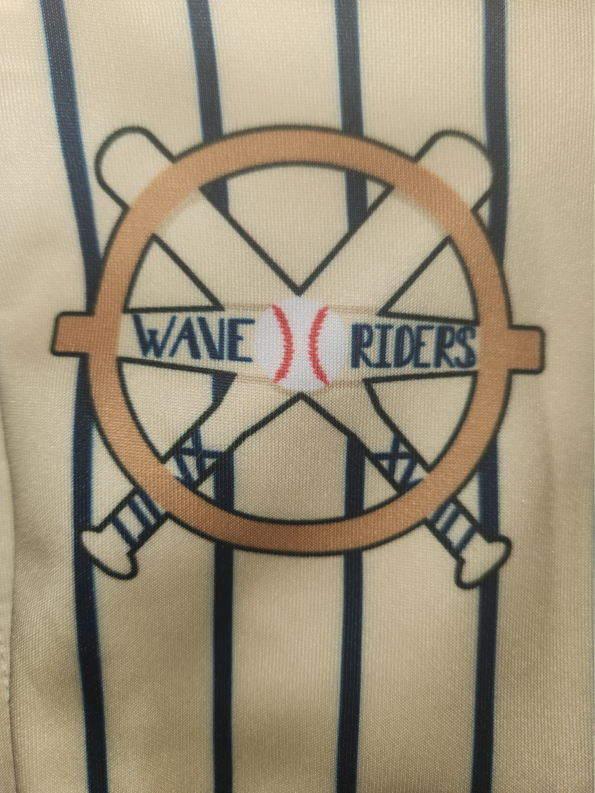
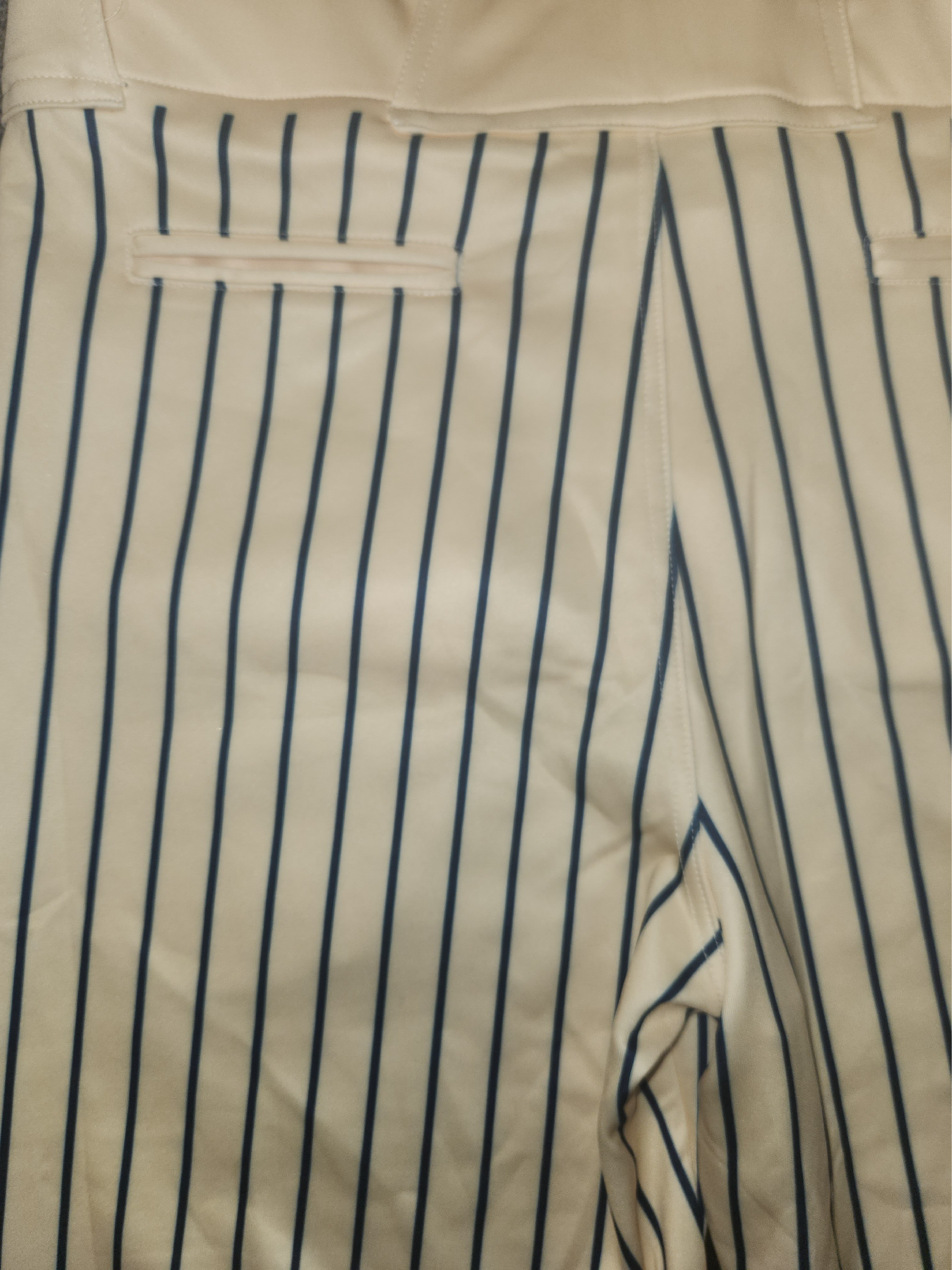
The Pants
With the pants, we wanted to emphasize the classic look from teams across the major and minor leagues. After doing some research and design prototyping, we decided to go with the beige-cream color to match the away jersey. This ensures that it matches one of the two jerseys and it looks good with both jerseys. On the left side of the waist there is the secondary logo printed directly on the fabric (pictured middle).